
The "gods" are not to Blame
How AI Gave Data a Voice and Now It Talks Back

It started on a Friday, because chaos would not respect tradition. I was knee-deep in a data quicksand: juggling ten tabs minimum, a half-conscious Excel sheet whispering “#REF!”, a grumpy database that blinked back at me like, “Do your own joins,” and yet another Power BI dashboard that refused to cooperate.
Somewhere between running a cursed SQL query, trying to untangle tuberculosis rates from medical health assessments, and looking for an immediate explanation for on-the-edge executives why our numbers didn’t quite match with the WHO’s, despite the allegedly “final_final_v3_latest.csv”. I found myself muttering “colorful words” at incomplete data fields.
And then mid-grumble, mid-caffeine crash, it hit me:
“What if my dashboard just told me what was going on? Like, actually spoke to me. Gave me answers ?”
Cue the spotlight. Enter stage left: Sipping API tokens and quoting Socrates, Large Language Models: The chatty minions I just realized I needed.
The Age of Dashboard Fatigue

Let’s be frank, dashboards are still cool, and necessary. I will personally refer to them as the Tamagotchis of data, I check in daily, feed them fresh KPIs, click through a few filters like I was performing sacred rituals, and maybe, even if the stars aligned, build a new widget just to flex my BI skills and spark my overperforming brain.
But over time, things have gotten...complicated…
Dashboards evolved from helpful little pets into clingy, high-maintenance demons. They demand constant input, never tell you what they’re really thinking, and always leave you second-guessing yourself. Too many charts, and not enough insight.
You know the ones. The ones that proudly display a dozen donut charts in approved official colors, all politely screaming at you with no clear direction. A three-tab workbook filled with gauges, bar charts, slicers, time filters, a tree map (why?), and somewhere in there a lonely KPI card blinking “DAU: ↓ 2%.”
Great. But... why is DAU down?
Was it the new onboarding flow? Did that last update break? Did Ovie post something again?
The modern BI dashboard has become the equivalent of shouting facts into a void.
Cool story, Bro. Now tell me why. And while you’re at it, what should I do about it?
In short, BI dashboards have somehow along the way become overwhelming and too long to ”Stare at”, but came along LLMs and suddenly I remembered that data could talk and better yet, Listen.
The Curious Case of the Angry Avocados

Large Language Models like GPT-4, Claude, and Gemini don’t just crunch numbers, they understand them. They interpret, connect the dots, and talk back. Think of them as that overachieving intern who not only reads every user feedback but also remembers it all and then casually drops something terrifyingly insightful like:
“Hey, I noticed that daily active users for Feature Z dropped right after we rolled out the new tooltip. Also, reviews started mentioning the word ‘confusing’ more. Want me to run a quick analysis on whether it’s hurting DAU?”
LLMs are like having a product analyst who never rolls their eyes when you ask “Can you…?” for the tenth time because they already did, and they added sentiment analysis from the app reviews just in case.
Old BI was reactive, LLM-powered BI is proactive, and I have to emphasize, almost nosy.
Looking at an old tale, let’s call it “The Curious Case of the Angry Avocados”: An online grocery startup called “Freshers” noticed a strange dip in repeat customers. A dashboard said: “Repeat rate ↓ 15% MoM.” End of story. But an LLM interface plugged into their warehouse logs, CRM tickets, and social media caught this nugget:
“Customers received avocados that ripened too fast due to unusually high local temps. This triggered refund requests and negative reviews. Recommend adjusting delivery packaging or switching to heat-resistant avocado varieties.”
That dashboard never stood a chance.
Conversations Over Charts

So, why are LLMs such game-changers for business intelligence? It comes down to one big shift: they let us talk with our data instead of just staring blankly back.
First off, there’s contextual awareness. Traditional dashboards might show you what happened, but LLMs dig deeper. They synthesize data from across multiple sources: analytics platforms, user feedback, release notes, CRM logs, and even those cryptic Slack threads where someone mentioned “the bug we maybe didn’t fix.” The result? Insight that isn’t just surface-level it’s stitched together with context.
Then there’s the conversational interface. You don’t need to know SQL, build a dashboard, or summon a data analyst like me with three monitors. Just ask: “What ?” and you’ll get a response that takes into account your usage data, churn trends, feature requests, and even sentiment analysis. It’s like having a cross-functional team in your pocket minus the calendar invites I hate.
Scenario simulation is where things get tasty-good. Want to test what happens if you increase ad spending in Lagos by 20%? Or roll back that onboarding redesign? Ask, and the LLM will model outcomes, simulate user behavior shifts, and throw in “what-if” projections without asking me to dust off my statistics textbook.
And finally, narrative reporting. No more dragging screenshots of my dashboards into slides and hoping my boss knows what a retention curve is. LLMs can auto-generate beautifully structured reports, summaries, and executive briefs written With footnotes.
This isn’t just a new interface, it’s a whole new relationship with your data. One that talks, listens, and if you ask nicely, explains what the discrepancy with WHO on Friday meant.
The Tools Leading the Charge

While dashboards are still very much relevant today, a new wave of tools is already reshaping the BI experience and they talk back.
First up, the big names: Power BI Copilot and Tableau Pulse have entered the group chat, bringing GPT-style interfaces that let you query data like you’re messaging a nerdy colleague. Want to know last quarter’s churn? Just ask. No more digging through filters like you're defusing a bomb.
Then there’s the cool startup crew; Seek AI and Arcee. These platforms are ditching the SQL-heavy textbooks in favor of storytelling. Here, the narrative matters just as much as the numbers. It’s BI for those who’d rather ask “What’s going on with our users?” than write a 12-line query to find out.
And of course, we can’t forget the mighty duo: ChatGPT Code Interpreter. You drop in a CSV, and before your coffee has a chance to cool, it spits out a dashboard, a summary, and three good recommendations like a data analyst who would not judge files named “final_final_v3_latest.csv”.
These tools aren’t just making BI more powerful they’re making it feel human.
From Dashboards to Dialogue, Now What?

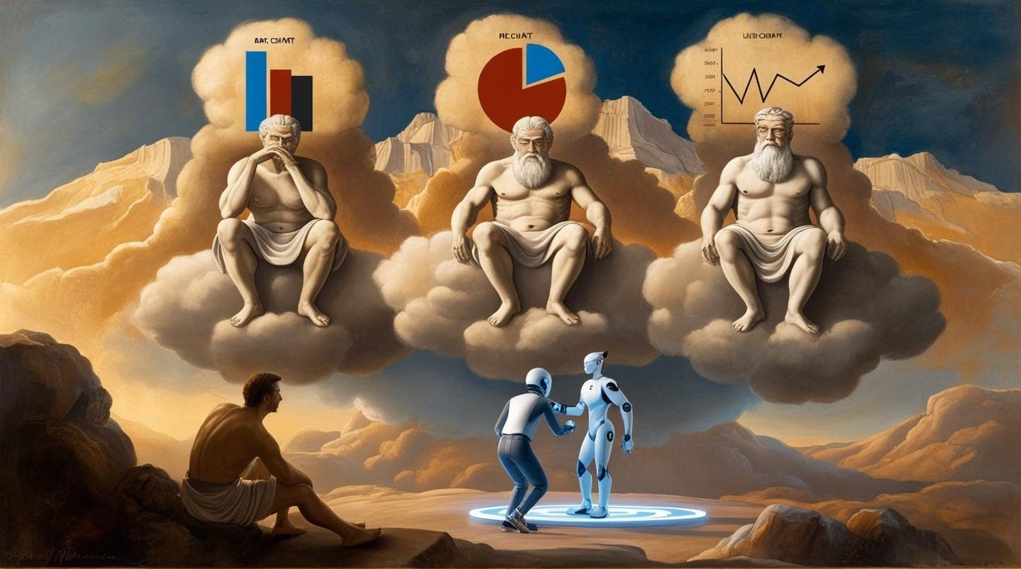
As I wrap up this write-up, eating paella to quiet a stubborn craving for jollof rice, I can’t help but reflect on how dashboards once felt like ancient oracles: sacred temples of truth that mostly blinked, beeped, and left us figuring out the rest.
But now? The Oracle finally speaks. And this time, it’s powered by AI. This isn’t just a tech upgrade. It’s a mindset shift from reporting to reasoning, from visuals to conversations, from “data-driven” to data-dialogue.
So the next time your dashboard flashes and your gut says “Something’s off,” don’t reach for another filter or pie chart. Ask your data to talk back. Because in this new era, the most powerful BI tool isn’t a chart it’s a conversation.
And finally, let’s be honest, if your dashboard isn’t helping you make decisions, it might just be another side quest. So maybe it’s time to stop building dashboards for dashboards’ sake and start building understanding instead.