

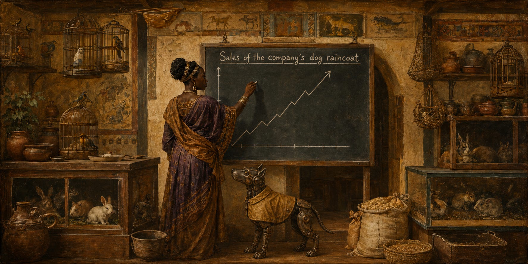
Here is a story about a raincoat.
Jane Doe is a data analyst at a mid-sized pet-accessories company. (She’s fictional, I know, but the situation is not.) One Monday, leadership is euphoric: sales of the company’s dog raincoat, a garment that makes a dachshund look like a tiny disgruntled fisherman, have tripled. Marketing takes a bow. The campaign worked. Someone mentions a bonus.
Jane is asked to “pull the numbers together for the board.” This is corporate jargon for confirming the story we’ve already decided to tell.
This step is where most data storytelling goes wrong before a single chart is made. Because the first rule of telling stories with data is that the story comes out of the data. It does not arrive in advance, wearing a lanyard, asking the data to validate its parking.
Start with a question, not a conclusion

Jane’s actual job isn’t “make a chart of the sales spike.” It’s to answer a question: why did raincoat sales triple? Those are different tasks. One produces decoration for a decision already made. The other produces knowledge.
So she starts the way every good analyst starts: by being suspicious of good news, or any news.
She plots raincoat sales over twelve months. There’s the spike, right where the campaign launched. Compelling. Then she does the thing that separates analysts from designers: she asks what else happened at the same time.
She pulls regional weather data and overlays rainfall on the same timeline.
The two lines move together like they’re slow dancing.
The campaign launched in the first week of October. So did autumn. Raincoat sales tripled because… and stay with me here… it rained. On dogs. Whose owners then bought them raincoats. Marketing’s genius campaign had the strategic impact of a poster for umbrellas taped up inside a monsoon.
Every data story has the same skeleton
Jane now has a real story, and it follows the same three beats that every data story needs:
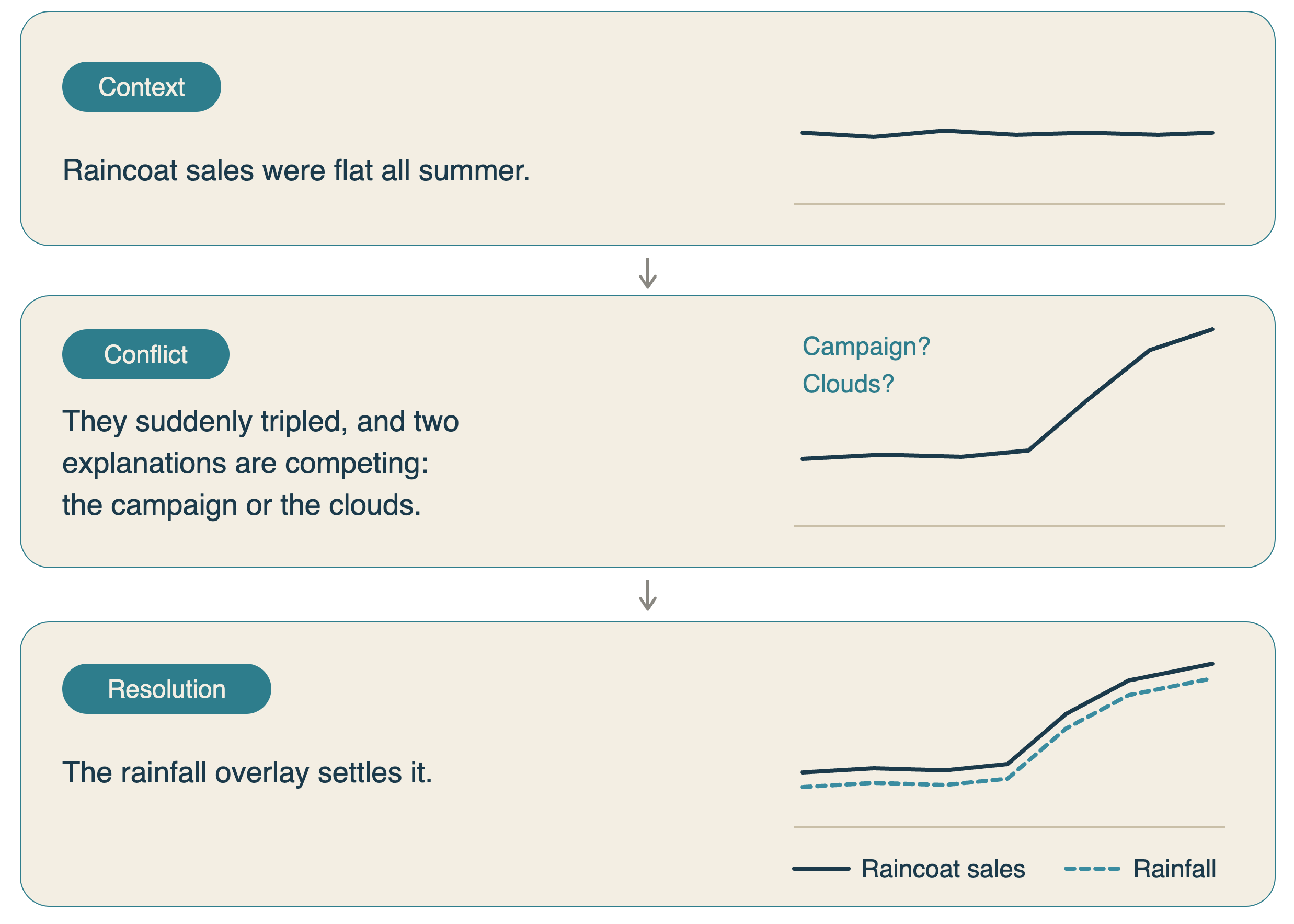
Context, conflict, resolution. That’s it. That’s the whole narrative technology, unchanged since I was a baby, crawling under coffee tables and headbutting the furniture. If your analysis doesn’t have a conflict, a tension, a surprise, or a “Wait, that can’t be right,” you have a report, not a story yet. Reports are where data goes to die.
The conflict is also where your protagonist lives. Data stories aren’t about numbers; they’re about someone, an event, or a ‘thing’ the numbers happen to. Jane’s story isn’t about “units sold increased 212%.” It’s “We almost paid a bonus for weather.”
The chart is the sentence

Now the visual. And here Jane faces the eternal temptation: to show everything she did rather than what she found. Twelve charts, one per month, plus a correlation matrix.
Her chart is two lines on one timeline: raincoat sales and rainfall. Nothing else earns its place. No gradient fills, no 3D, and no legend the reader has to consult like a treasure map. Every drop of ink either carries information or gets cut.
Then comes the move that does more work than any design decision:
The title is the takeaway. Not “Raincoat Sales and Precipitation, Oct–Dec.” That’s a filename. The title is “It wasn’t the campaign. It was the rain.” The reader should get the story before they’ve read a single axis, since most of them won’t read it. A compelling chart title is the story; the chart is merely the evidence.
One more craft note while we're here. When you do need a chart, pick the one that matches the question. The science is simple: human eyes are excellent at judging which of two bars is taller and terrible at judging which of two pie slices is fatter. That's peer-reviewed, and it's why your pie chart is quietly failing everyone who looks at it. Comparing amounts? Bars. Change over time? Lines.
The dinosaur in the spreadsheet

Why insist on the visual at all if the numbers "say" the same thing? Because they don't. Statisticians have built datasets that are identical in every summary statistic, same average, same spread, same correlation, and yet visualize as completely different pictures. One of them is a Tyrannosaurus rex.1 Your summary statistics can be hiding a dinosaur. You will not find it in a table.
But the same power cuts the other way, which is why Jane’s last step matters most: she tried to kill her own story. Correlation is a notorious tease, so before the board deck, she checked whether raincoat sales also spiked in regions where it didn’t rain. They didn’t. The story survives. Ship it!
That’s the playbook, threaded end to end: start with a question, hunt for the conflict, find the protagonist, resolve it with a message per visual, make the title the takeaway, match the chart to the comparison, and then attack your own conclusion before someone in the boardroom does it for you.
Marketing, for the record, took the news gracefully, then proposed a Q1 campaign for dog sunglasses.
Jane has already downloaded the UV index.
Matejka, J. & Fitzmaurice, G. (2017), “Same Stats, Different Graphs: Generating Datasets with Varied Appearance and Identical Statistics through Simulated Annealing,” CHI 2017 (the “Datasaurus Dozen,” building on Anscombe’s Quartet, 1973). https://www.research.autodesk.com/publications/same-stats-different-graphs/